
LivingRoom Productions is, to put it bluntly, a collection of nerds.
These specific nerds happen to harbor a deep fondness for musical theater, and so they (meaning "we") get together once a month to navigate the uncharted waters of staging complete Broadway shows in someone's living room. Three seasons of doing this have yielded a plethora of touching and inspiring performances, as well as countless instances of unintended hilarity, all solely for the benefit of the performers because there's no room for an audience.
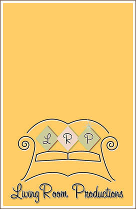
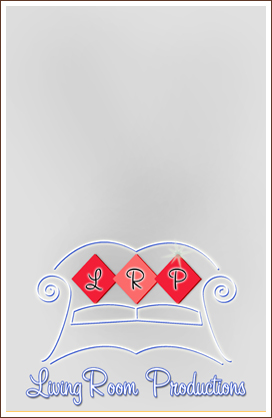
Way back when this whole venture was little more than a glint in the co-producers' eyes, I was asked if I could help put together a logo, specifically one with a couch theme. So I unleashed my imagination and came up with this:
![]()
At the time, I was terrified of vector graphics in general and Adobe Illustrator in particular, but I ventured in lightly to make the diamond shapes that represent the pillows. It has since been pointed out to me that these look like they might be in the running for the least comfortable pillows in the world, and to that I say first that I don't believe that any officially sanctioned competition for that actually exists, and second, that if you think the pillows are uncomfortable, you should try sitting on the couch, which is apparently constructed of glowing wires.
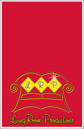
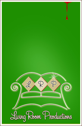
The logo was refined to look like this:
![]()
The logo was originally intended to adorn the cover of a Playbill-style program to accompany each show, which it was also my pleasure and privilege to design. Here's a shot of the first cover, from LRP's August 2008 production of Evita, the hit show about a cartoon cat who likes lasagna. Or something like that. Anyway:
Evita
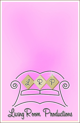
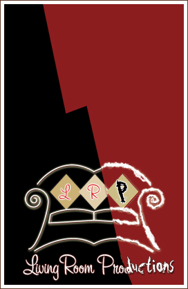
My initial thought was that the program cover would remain the same for all of LRP's shows. That idea changed with LRP's second show, Pippin, a show whose awesome and totally factual portrayal of the life of Charlemagne's son makes it a more perfect candidate than any other show for the color purple. After that, I made attempts to have most of the covers reflect the historically familiar color schemes of each of the shows, where applicable. Kiss Me Kate got a red-yellow-black treatment. For Sweet Charity, which has always struck me as bubblegummy, I picked pink. For Les Miserables, I worked off the iconic image of Cosette against the French flag and went gray with red and blue accents, though it occurs to me only now that red-and-black might have been a better choice. Oh, well.
Kiss Me Kate
![]()
Sweet Charity
![]()
Les Miserables
I won't bother discussing the cover for Urinetown.
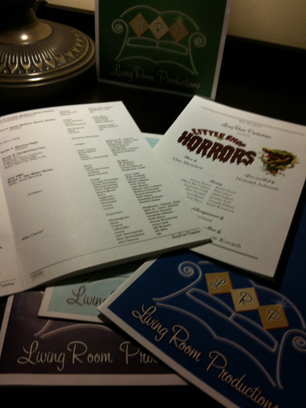
Starting with the cover for Little Shop of Horrors (May 2010), I ventured tentatively into using graphical enhancements on covers that had previously been little more than color fields with the LRP logo. So instead of going with a plain green cover, I threw in a little blood drip on the top:
Little Shop of Horrors
(My wife is likely to maim me if I don't mention that the blood drip was her idea.)
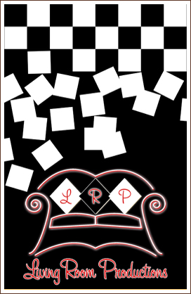
During LRP's third season (2010-2011), I took occasionally greater chances with the cover designs, producing such gems as this for Jekyll & Hyde:
Jekyll & Hyde
...and this for Chess:
Chess
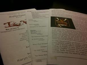
I didn't just do the covers, either. All in all, my program work for LivingRoom Productions has yielded 28 complete show bills, which is the most amount of program design work that anyone has ever done in the recorded history of mankind. Here are some samples from the beautifully laid-out interiors:
![]()
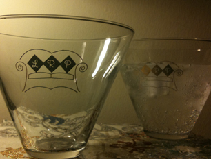
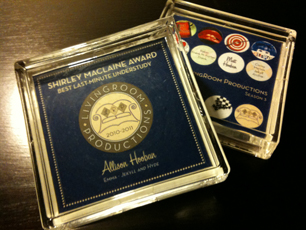
The logo itself has remained the same for the three years of LRP's existence, and as time has gone on, it has been used in ever more creative settings. For a gift to the cast members at the end of the second season, the logo was screened onto stemless martini glasses. And for the season 3 finale, a punched up version of the logo was incorporated into the design of LivingRoom Productions' annual self-congratulatory awards, the LRPys. Following the issue of the season 1 and 2 LRPys in Shrinky-Dink keychain form, season 3's LRPys were made into coasters, providing a convenient resting place for the martini glasses. Take a gander:
![]()
Only the two dozen or so performers that have graced the LRP stage (or rug?) have been privy to these designs before. I'm happy to share them with you, but if you're looking for tickets to the next LivingRoom Productions show, I'm afraid you're out of luck.

![]()
![]()

![]()
![]()
![]()
![]()
![]()
![]()
© 2011, Pie a la Mode Productions