

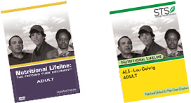
People need feeding tubes, it's a fact. And feeding tube companies need customers. That's a fact, too. The ages-old question has always been, how will the people who need feeding tubes find the people who are selling them? Enter Simplified Training Solutions, a company whose name is not entirely indicative of what business it's in. Together with Nutritional Lifeline, they provide services and products geared largely toward ALS sufferers and their families, as well as a series of DVDs meant to educate consumers about "the feeding tube decision."
Simplified Training Solutions has a perfectly functional website, but they approached me because they were interested in exploring the possibility of punching it up a little bit. In addition to the website, I offered them a total overhaul of their brand, intended to inject a graphical idea of simplicity into their entire identity.
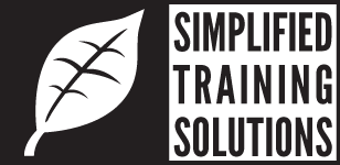
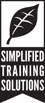
The first thing I offered them was a logo concept.
![]()
![]()
![]()
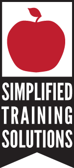
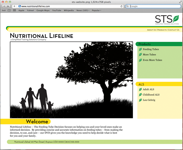
The iconography here – unsophisticated natural elements in silhouette – are thematically connected to the company's mission as well as part of its corporate identity (Nutritional Lifeline). The bright colors against black-white elements project vibrancy health, and knowledge. The concept was ideally suited for STS/NL's existing range of printed materials, and it provided them a clean, crisp, cogent brand usable throughout their suite of products and presences.
Before-After
The concept also provided inspiration for a clean, attractive website concept centered around the idea of keeping the site graphically interesting while preserving its austerity.
In the end, Simplified Training opted to give their business to a family friend (I hate when that happens), but the design nevertheless lives on here as a case study in brand construction.

![]()
![]()

![]()
![]()
![]()
![]()
![]()
![]()
© 2011, Pie a la Mode Productions