
The story of the Creampuffs begins, as these tales so often do, at the exact moment my parents conceived me. The planets and the stars were in unusal alignment that day, so that unbeknownst to my parents or me, forces were set inexorably in motion that would eventually lead my friend Andy to ask me if I wanted to join his fantasy baseball league. After a good deal of hemming and hawing and consultation with the aforementioned stars and planets, I said yes.
I wanted a team name that I felt would properly capture my contribution to the league's competitive spirit - something that adequately encapsulated my vast managerial expertise and the level to which I would, for lack of a better term, "bring it."
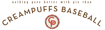
And thus was born Creampuffs Baseball.
Naturally, I was pretty excited about the opportunity to put together a roster of players and get into the nitty-gritty of head-to-head competition, which are arguably the central points of fantasy baseball. But I was even more excited about the chance to design a new logo, and that was where the bulk of my focus went.
For inspiration, I drew from a current trend in logo design that pairs a circular seal, a clean, sans-serif font, and a single design element. My first stab at the logo came out looking like this:
After I uploaded it to Yahoo! and set it as my team's profile picture, I came to the conclusion that there were two major problems with it: first, that the cream didn't quite bulge out of the ball enough, and second, that the seams - particularly the lower one, weren't as curvy as I wanted. So I went back to the drawing board, and made some subtle changes:
Believe it or not, the nerdiest part was yet to come.
I'm a fan of uniform design and a devoted reader (and member) of UniWatch as well as a couple of other sports design sites. So having seen others develop uniform concepts for imaginary teams of their own, I decided to try my hand at coming up with a uniform concept. It just so happened that I was sick and missed work a couple days after I finished the logo, so I sat down at my computer and started working on two simple cap logos - one modern and one with a slight vintage flair:


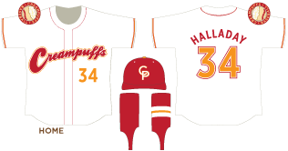
Next came a script wordmark that would go on the home jersey.

I then added it to a jersey template I had traced, threw in the hat and stirrups and presto! Home uniforms for a team that has no actual home:
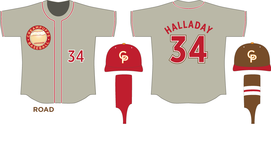
For the road jerseys, I decided to use a sort of muddy gray-brown color instead of the traditional plain gray, just to set the team apart from all the other fictional teams out there. The rest of the concept is simple enough.
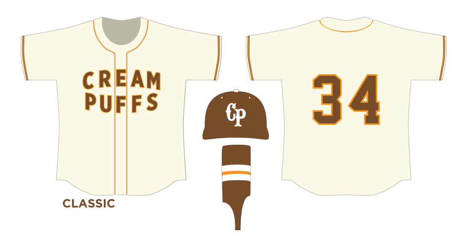
Something about the Creampuffs name seemed to lend itself to an old-timey feel, so the next thing I did was come up with a "classic" version of the uniform, from an earlier era when the Creampuffs also didn't exist.
From there, it was a hop, skip, and a jump (plus another sick day) to a couple of alternate uniforms. (Font aficionados may notice that the wordmark on the first alternate jersey uses a font called "Creampuff.")
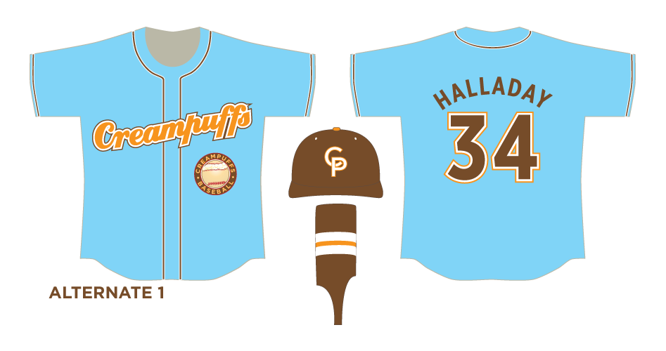
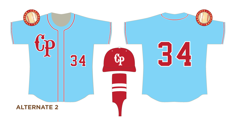
And there you have it. A suite of uniforms to cover every occasion, for a team that will never need them. Here's the entire Creampuffs Style Guide.
I indulged in just one other bit of insanity relating to the Creampuffs after reading an article on UniWatch that featured a contributor named Tim O'Brien who had made a Photoshop template of Washington Nationals pitcher Stephen Strasburg that could be customized with your own graphics to produce a real-life approximation of a uniform design. Wanna see what the Creampuffs would look like in real life?

![]()
![]()


![]()
![]()
![]()
![]()
![]()
![]()
© 2011, Pie a la Mode Productions